Skyscanner is a global travel search company that helps people find and compare flights, hotels and car hire from one place. Its app and website take travellers from the earliest stages of planning through to the point of booking and are used by more than 100 million people around the world each month.
Skyscanner had started life as a flight comparison tool. By the time I joined, the product had grown into something much broader, helping people plan more of their trip across flights, accommodation and transport. The brand had not evolved with it. It was widely recognised and trusted, but remained closely associated with search and expressed little of the anticipation, discovery and emotion people associate with travel.
The company was also beginning to think differently about the role it wanted to play. Skyscanner wanted to move beyond simply finding options and become a traveller-first brand that helped people make better decisions throughout their journey. Bringing the brand in line with that ambition required a complete rebrand, redefining how Skyscanner looked, behaved and communicated across its product, marketing and every other touchpoint.
We partnered with Koto, an independent branding studio, to create the new identity. Koto embedded their team within Skyscanner, working directly alongside a dedicated cross-functional team of designers, illustrators and motion designers that I built and led. We operated as one team throughout the project, creating a genuine partnership in which strategy, identity, product and implementation were developed together rather than handed from one group to another.
I led the rebrand from within Skyscanner, aligning Product and Marketing leadership around the direction and working closely with Koto to shape, challenge and evolve the identity. We needed to give the brand far greater range and expression without losing the clarity, simplicity and trust that had made the product successful. The resulting system also had to work as effectively inside the product as it did in marketing, while remaining coherent across more than 50 international markets.
This balance became the thread running through the work that followed, bringing Skyscanner's brand and product back into step and creating an identity that reflected the company it had become and the role it wanted to play in travel.
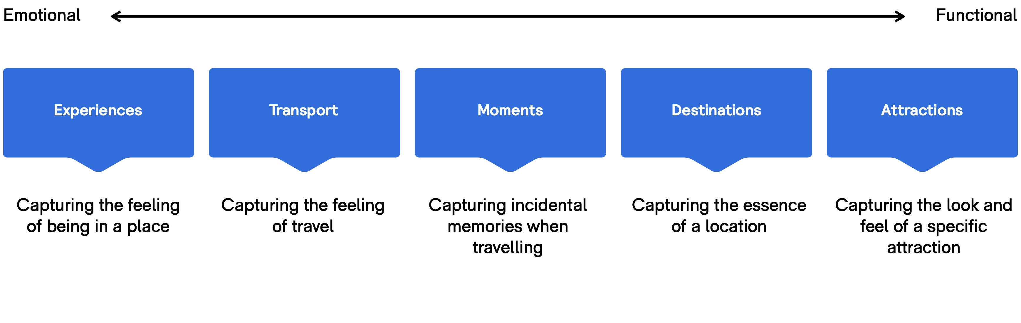
Skyscanner had outgrown its brand. The product had evolved from a flight comparison tool into a broader travel platform, but the brand remained rooted in its original function. It was clear, efficient, and trusted, but overly narrow in how it showed up, anchored in search both visually and in tone.
It lacked emotional range and did not reflect the anticipation, discovery, and variety that define travel. While Skyscanner helped people travel, the brand itself did little to evoke the feeling of travel.


At the same time, the wider category had become increasingly generic. Competitors were converging on the same interfaces, the same messaging, and the same visual language, making meaningful differentiation difficult. Users were often choosing between incrementally different prices within products that looked and behaved almost identically.
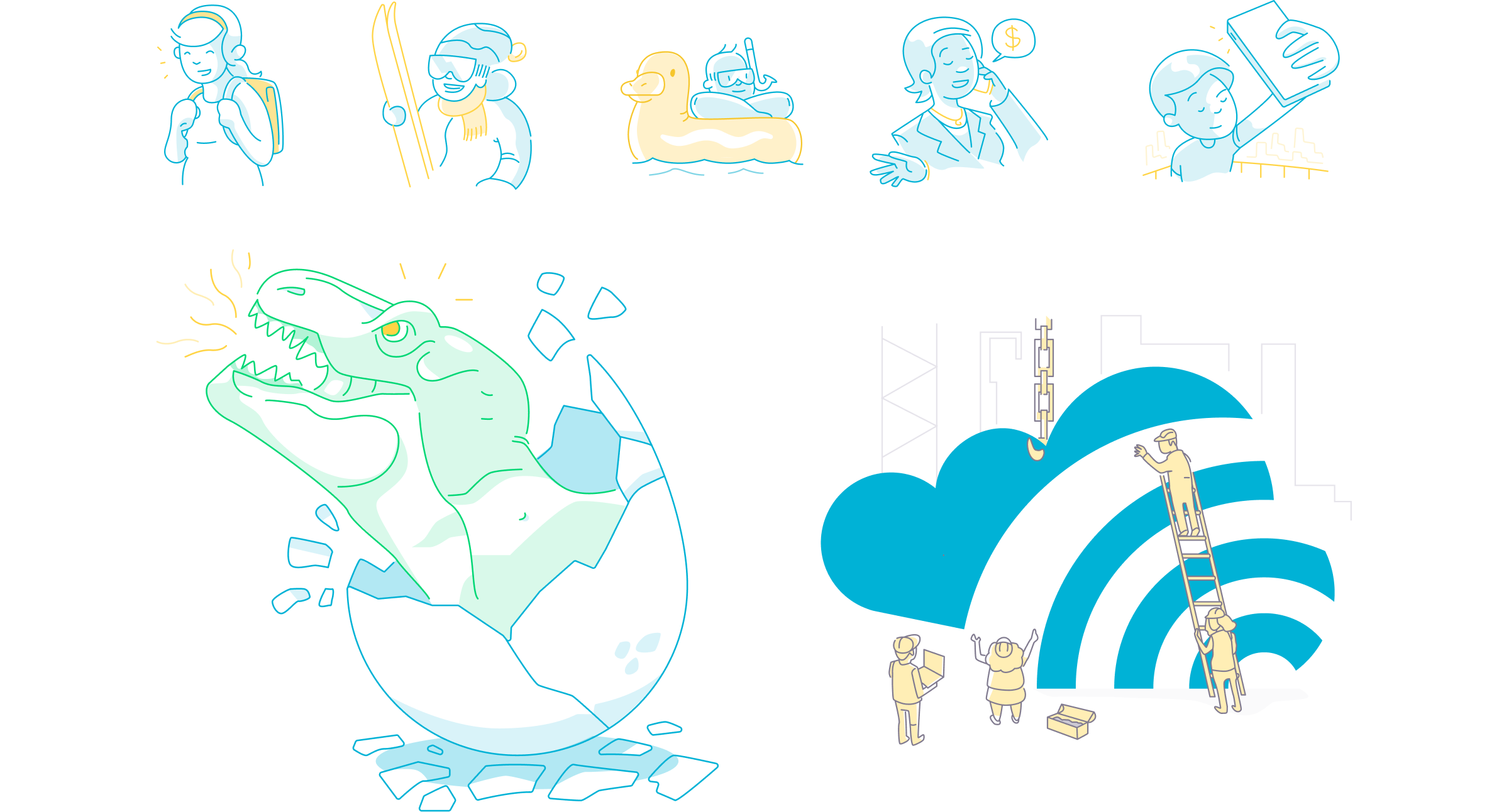
The problem was not recognition or trust, it was limitation. The brand needed to expand its range without losing the clarity and usability that made the product successful, while working consistently across product and marketing.
The rebrand needed to do more than update how Skyscanner looked. It needed to expand what the brand could express, while continuing to support a product built on clarity, speed, and trust.
The existing brand was tightly associated with search. It performed well in that context, but it limited how Skyscanner could show up across the broader travel experience. The goal was to expand that range without losing the qualities that made the product successful.
This translated into four areas of focus:
The work was structured across four phases, each with a distinct role in moving from understanding through to delivery. The phases were sequential but connected. Each stage built directly on the previous one, ensuring that design decisions were grounded in strategy, and that the final system could be delivered consistently at scale.
My role was to ensure alignment across these phases – connecting product, brand, and regional teams, and maintaining a consistent direction from strategy through to execution.
Immersion and research focused on building a shared understanding of the product, the brand, and the category. This combined internal perspectives with external data to ground the work in real behaviours, perceptions, and constraints.
Insight and strategy translated that input into a clear position for the brand. This defined what Skyscanner needed to stand for, how it should behave, and where it could differentiate.
Identity development explored how that strategy should be expressed. This involved developing and testing creative territories before building a cohesive identity system.
Design and delivery focused on implementation. The identity was integrated into product and marketing systems, with the structure and guidance required to scale consistently across platforms and teams.
The phases were sequential but connected. Each stage built directly on the previous one, ensuring that design decisions were grounded in strategy, and that the final system could be delivered consistently at scale.
The work was grounded in structured research, combining quantitative data, social analysis, and direct user input to build a clear picture of how the brand was perceived and where it was falling short.
We partnered with Kantar to analyse brand perception using TGI (Target Index Group) data, building a detailed view of behaviours, motivations, attitudes, and usage patterns. This established a baseline for how Skyscanner was understood relative to competitors and where there was space to differentiate.
We used Brandwatch to monitor share of voice and sentiment across social media, news, blogs, forums, and review platforms. This provided a view of how Skyscanner was being discussed in the wild, how it compared to competitors, and where stronger brands were outperforming in perception and expression.
We ran focus groups and community interviews to test brand recall, competitor perception, and emotional response, grounding the work in how users actually experienced the brand.
Four consistent themes emerged:
The insights led to a clear positioning for the brand. This "traveller first" positioning acted as a blueprint for the new brand purpose and direction.
We defined a set of guiding brand values and personality traits that informed decisions across the work, from day to day queries through to long term challenges. It defined how the brand should look, act, and sound.
I led alignment on this positioning with Product and Marketing leadership, ensuring it was not just a statement, but something that could be applied consistently across both product and brand decisions.
We began with a four day off-site in Barcelona, bringing together all 60 members of the global design team.
This was the first time the team had been brought together in one place, aligning product, brand, and regional teams around a shared understanding of both the problem and the opportunity.
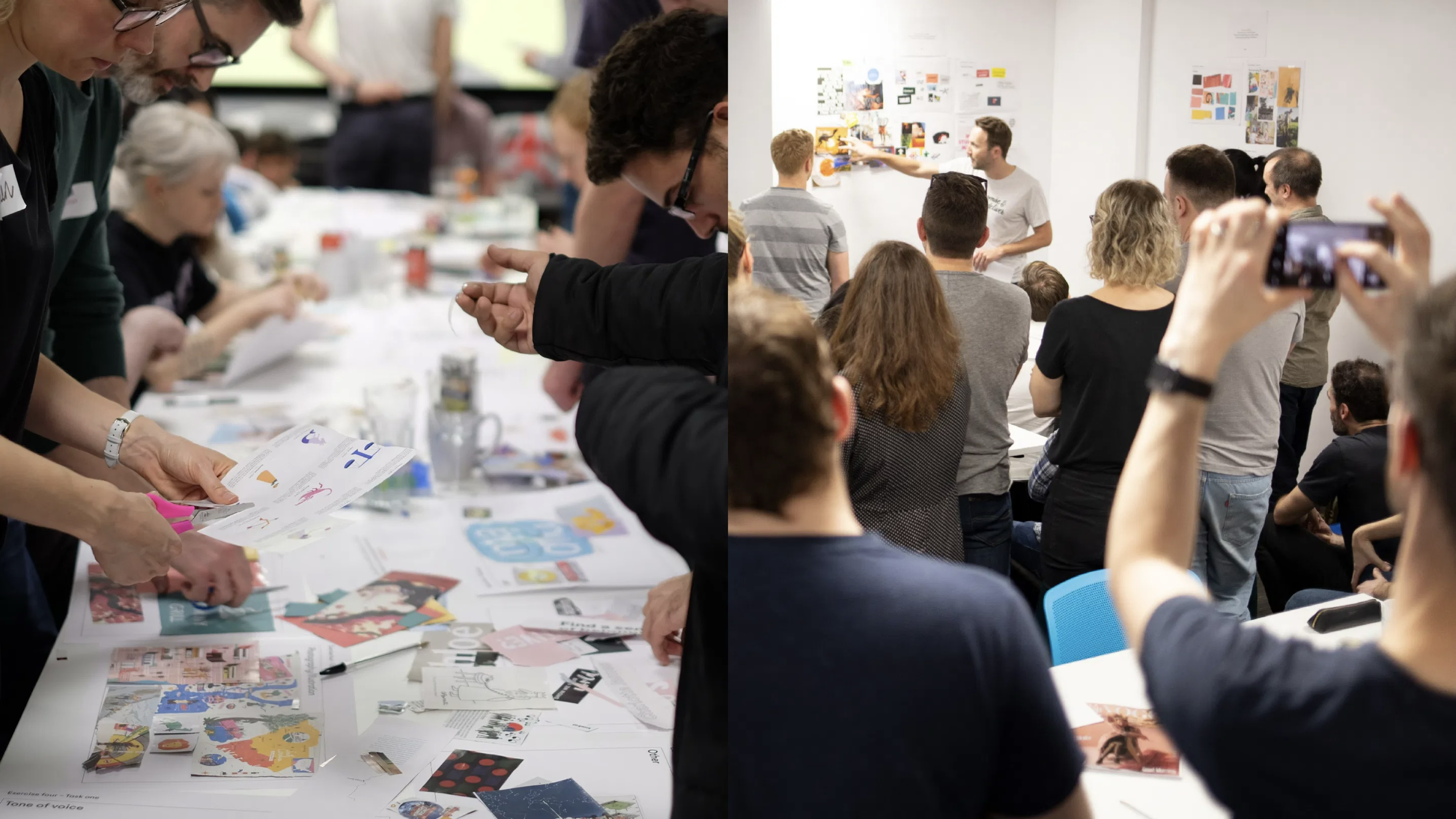
We used the workshop to establish a clear foundation for the work. It combined product and brand reviews, competitive analysis, and collaborative exercises, helping us define a shared view of what Skyscanner represented and what it needed to become.
The outcome was alignment before moving into strategy and design, with a unified direction across teams that would need to deliver the work globally.
To explore that range, a series of distinct creative territories were developed. Each direction tested a different balance between clarity, personality, and expression – helping define where the brand should sit.
I worked closely with Koto to shape and critique these directions, ensuring they were evaluated not just on visual quality, but on how effectively they could scale across product and marketing.
Each territory was tested against real-world application – from dense product UI through to global campaigns – to ensure the work could operate across the full Skyscanner ecosystem.
The goal was not simply to choose a direction, but to understand the boundaries of the system – what needed to remain consistent, and where the brand could introduce flexibility and expression.

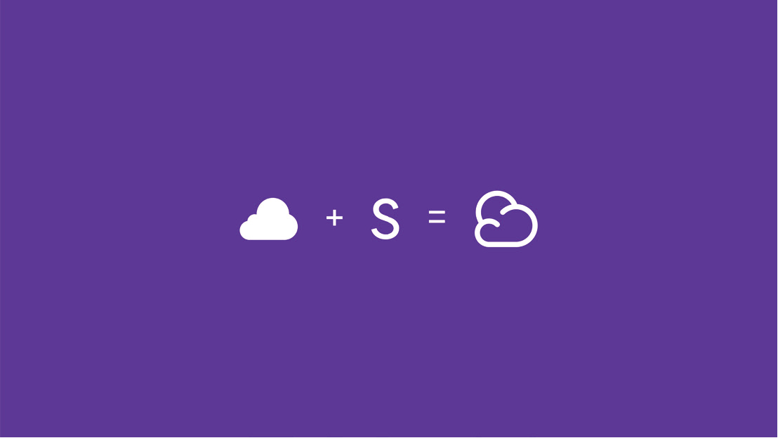

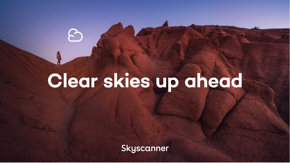
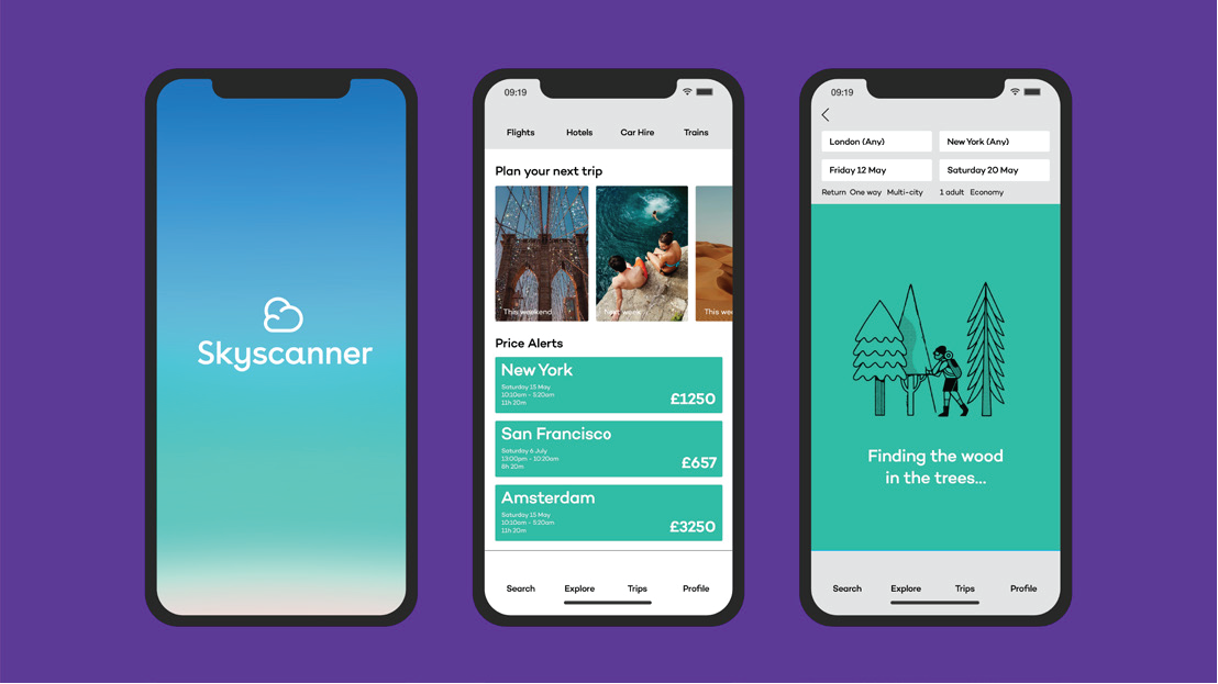
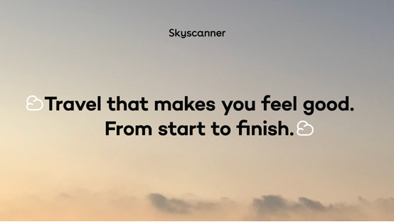


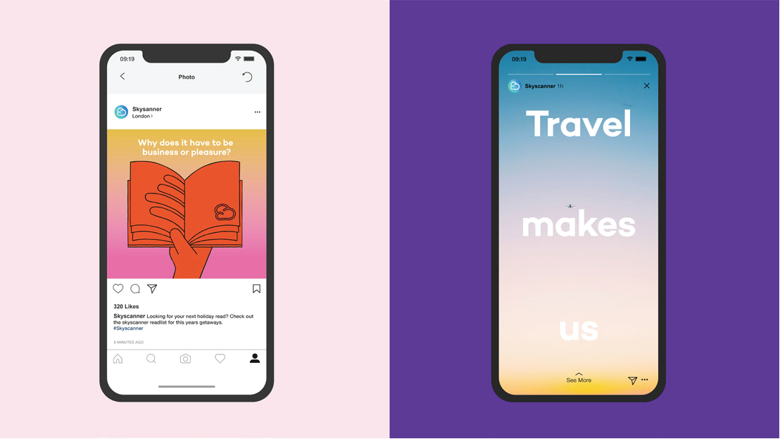
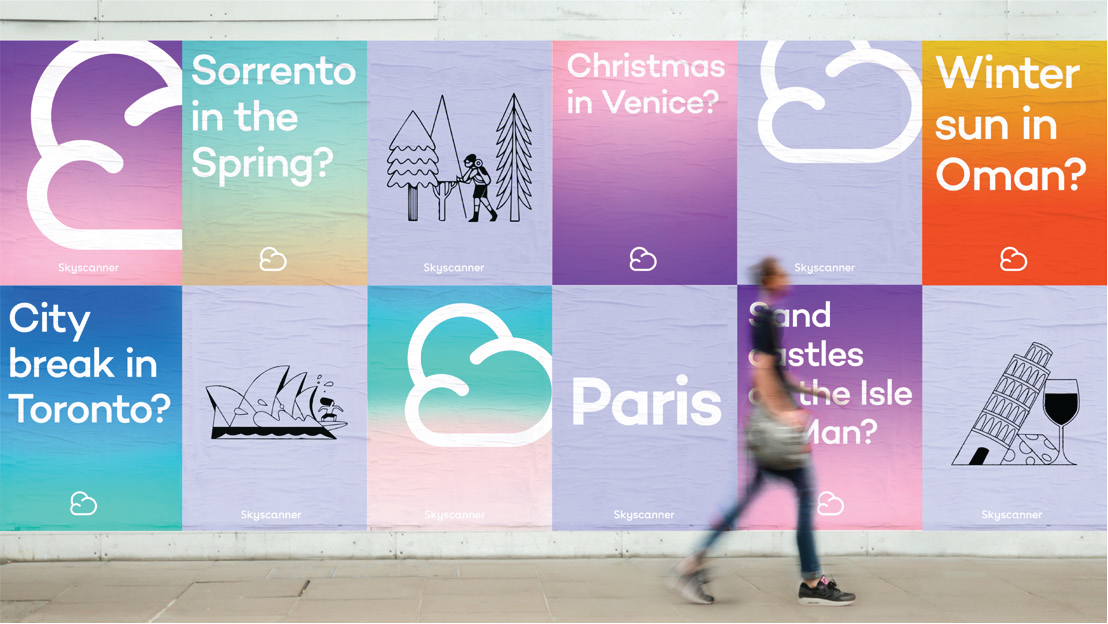
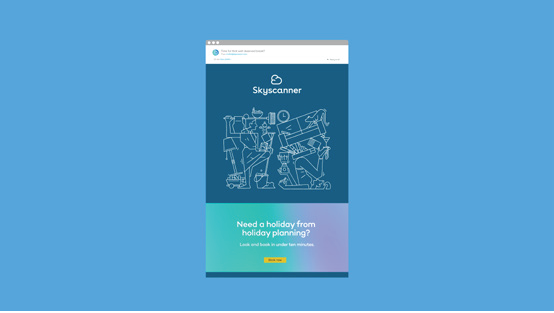





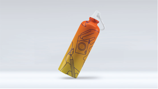

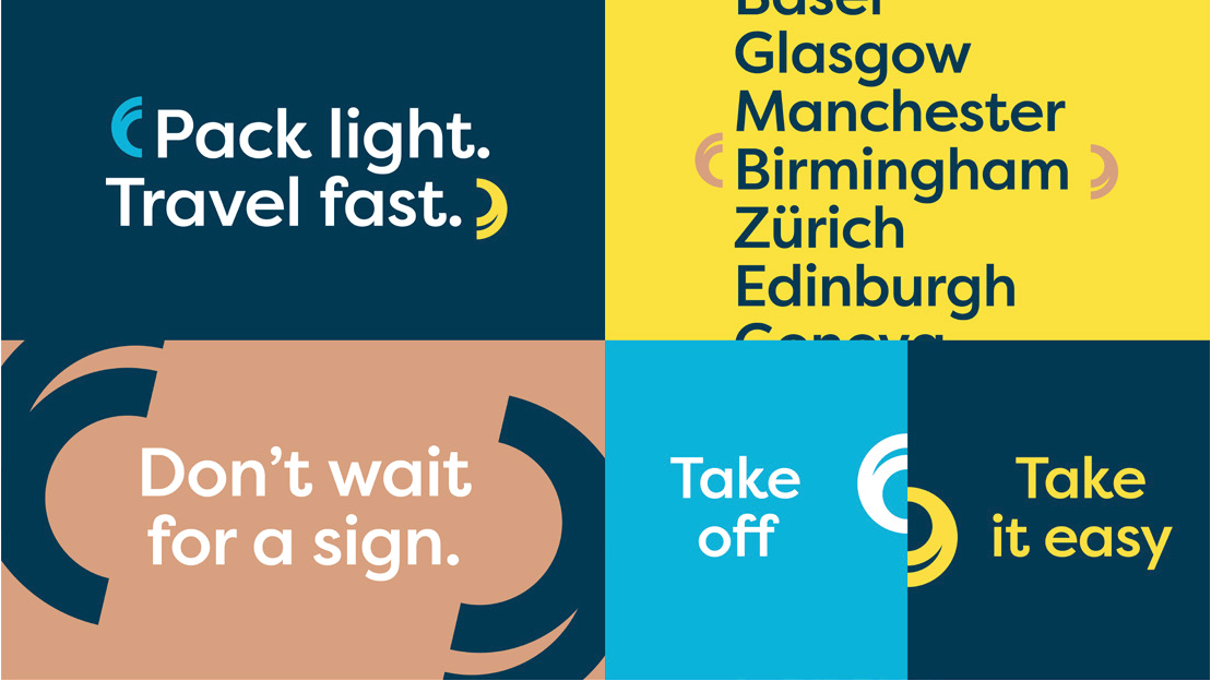


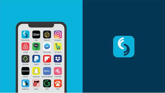
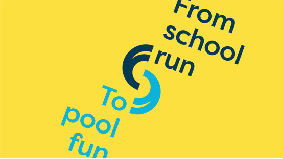
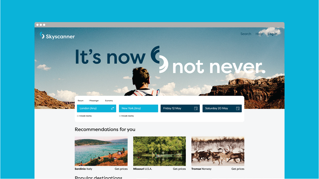
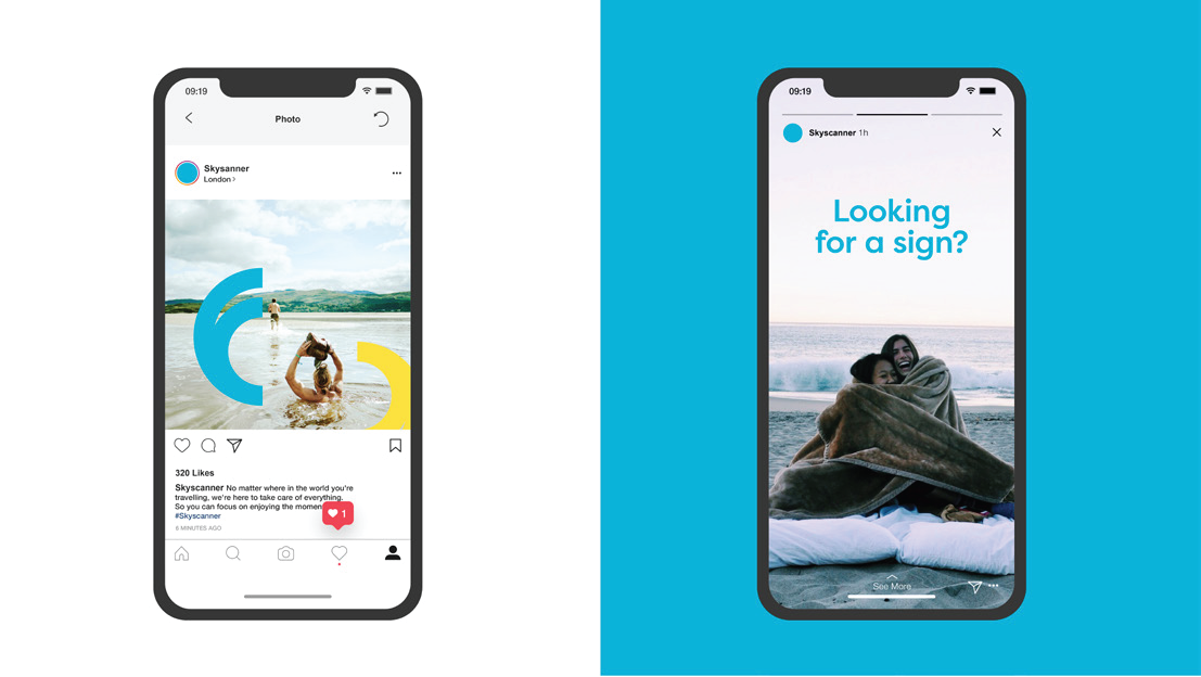
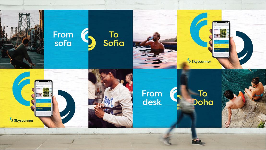



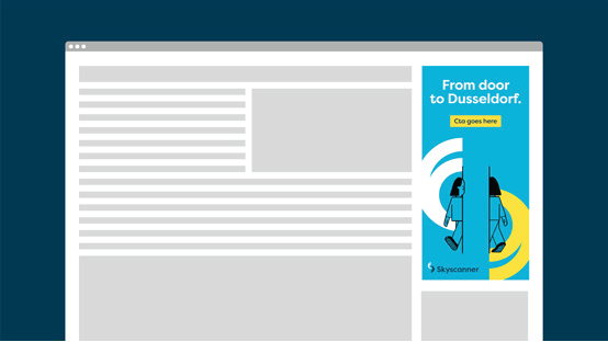


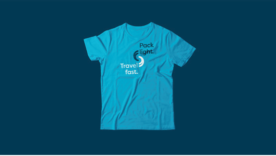
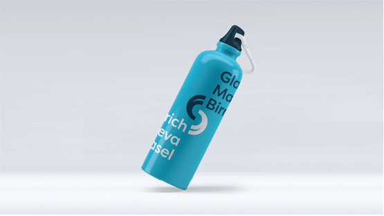

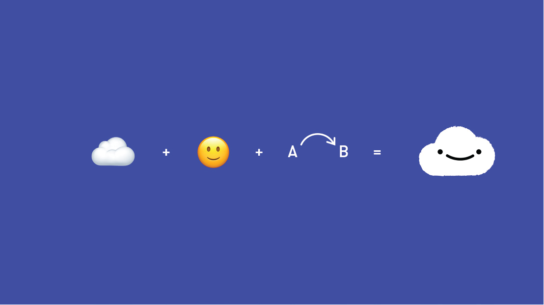


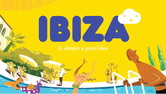
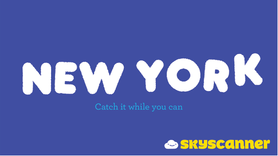
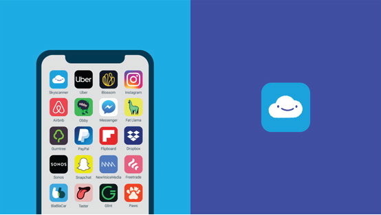


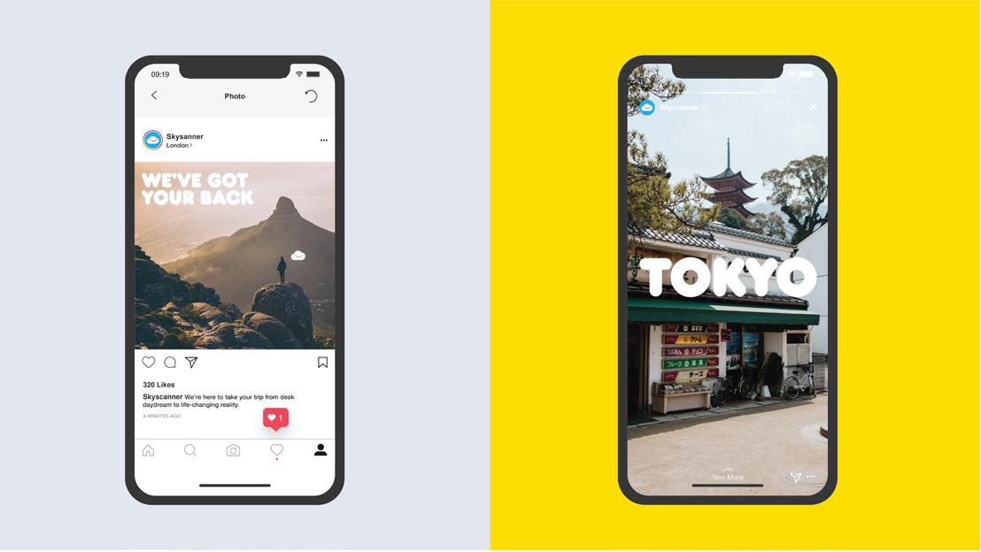

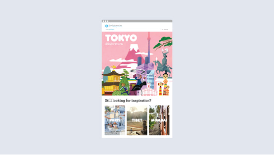
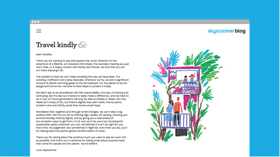

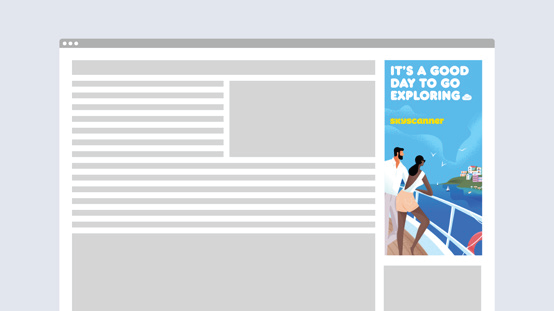
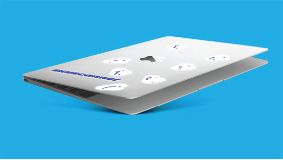

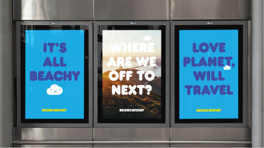

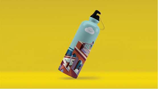


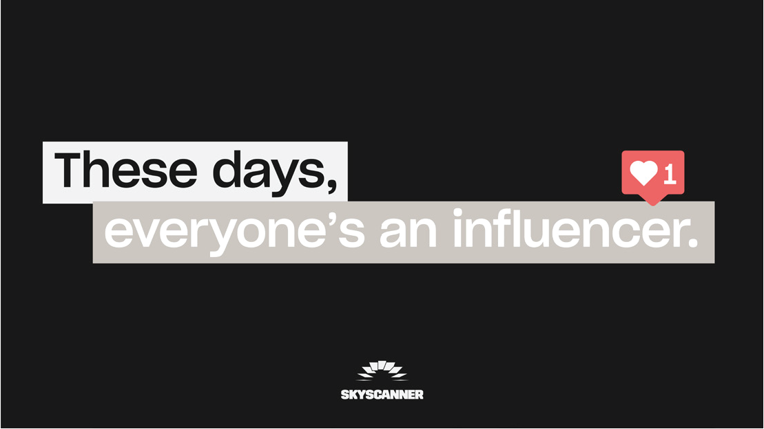

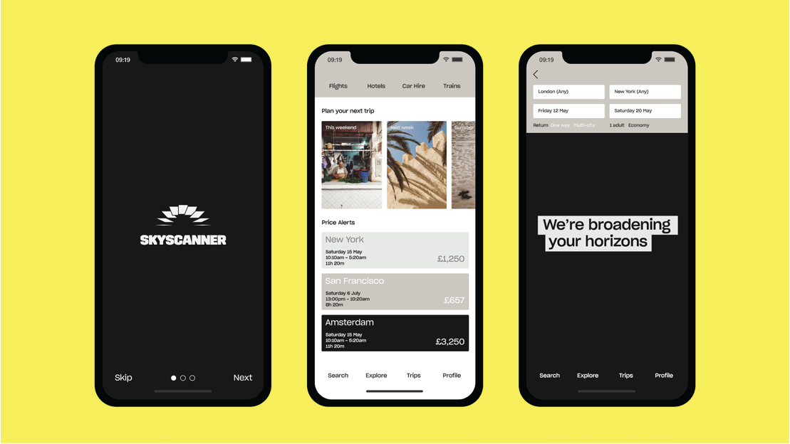
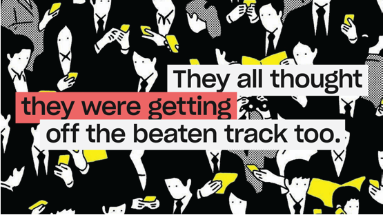
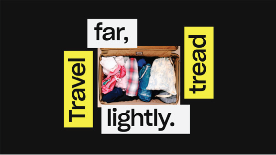
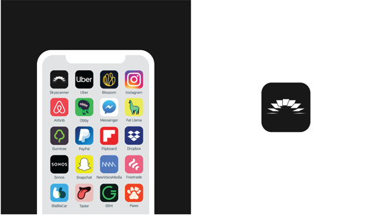
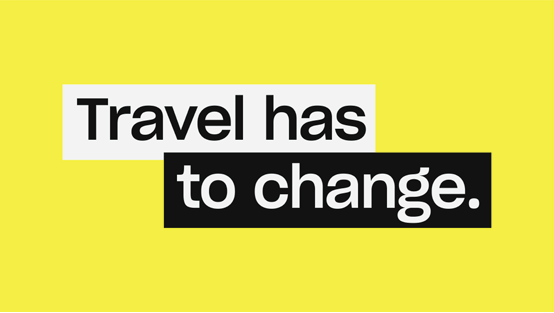
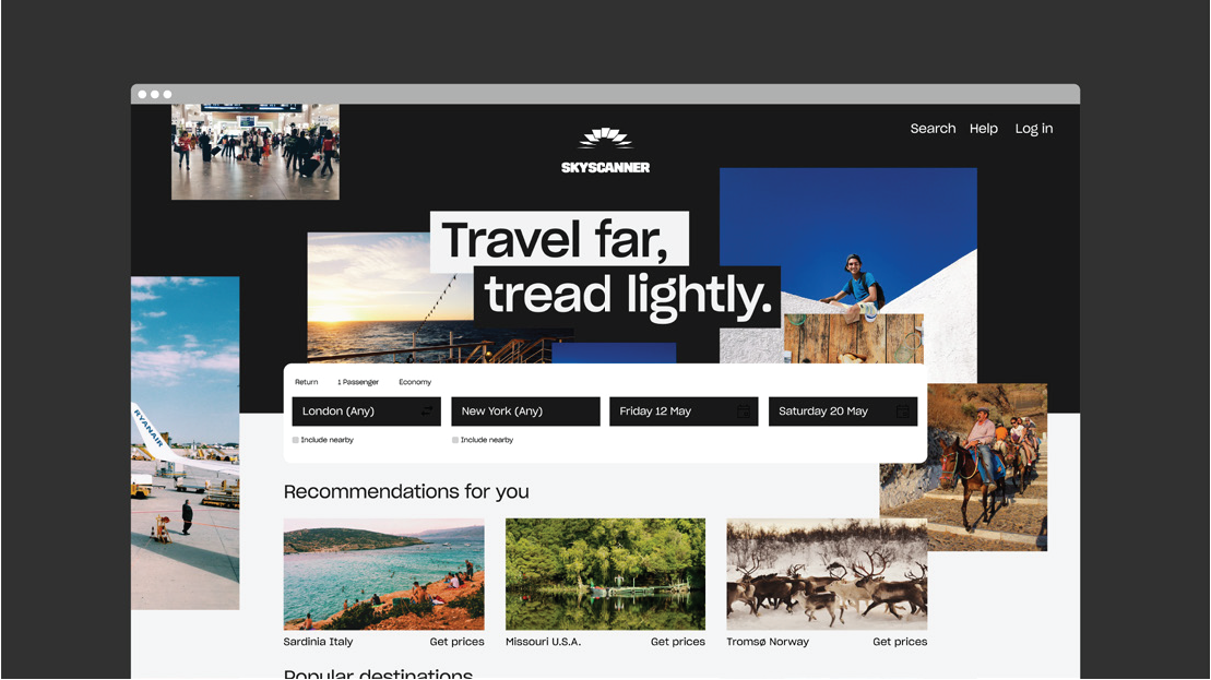
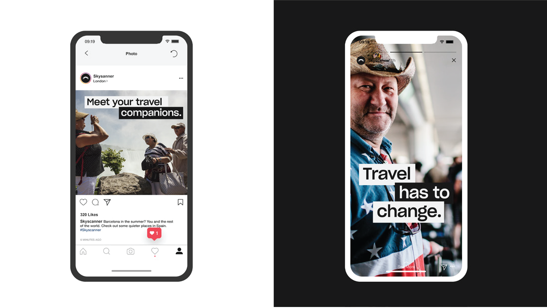


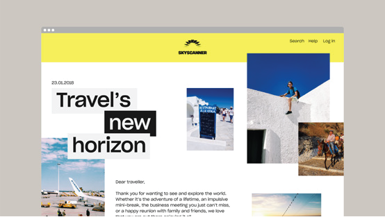

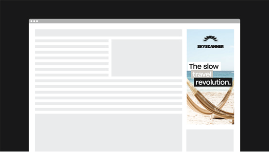
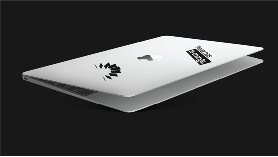


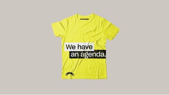
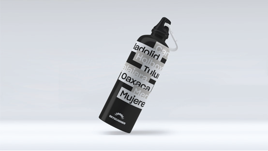
The identity was designed as a cohesive system of components, built to work seamlessly across product and brand.
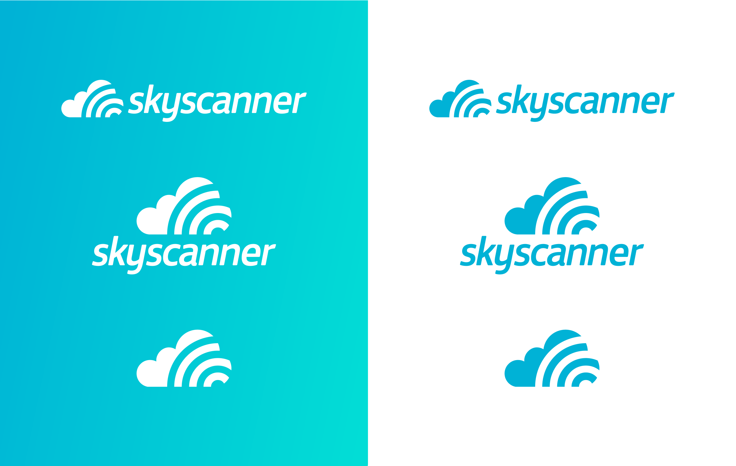
Rather than relying on a single defining idea, the work focused on refining and aligning a set of core elements: symbol, typography, colour, photography, and graphic devices. Each was designed to perform across different contexts.
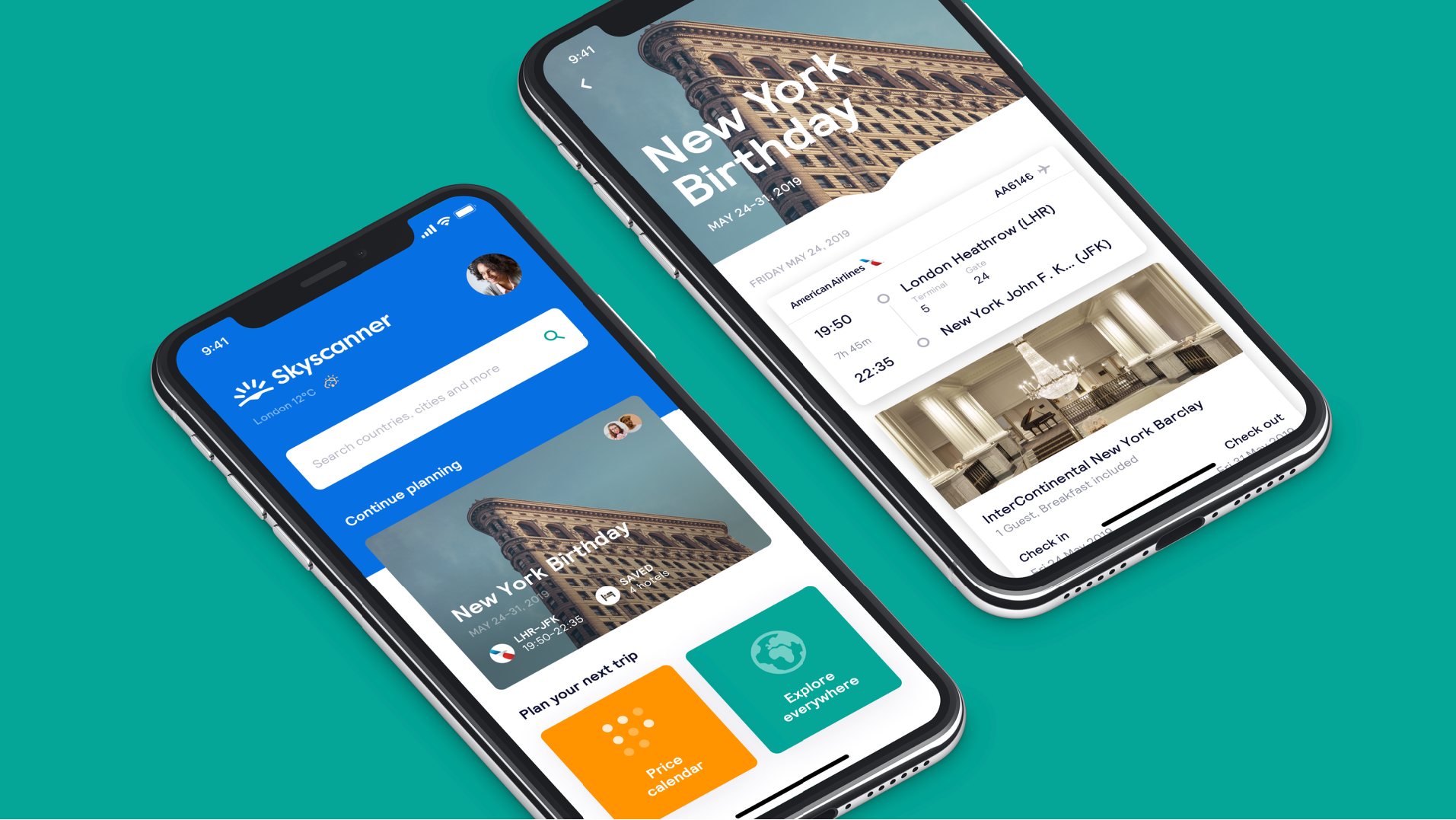
The identity was designed to work in real life – not just in the brand guidelines.
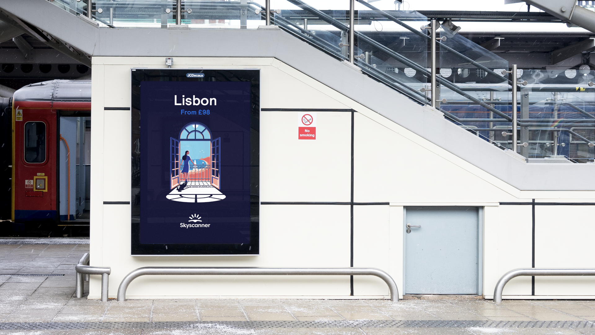
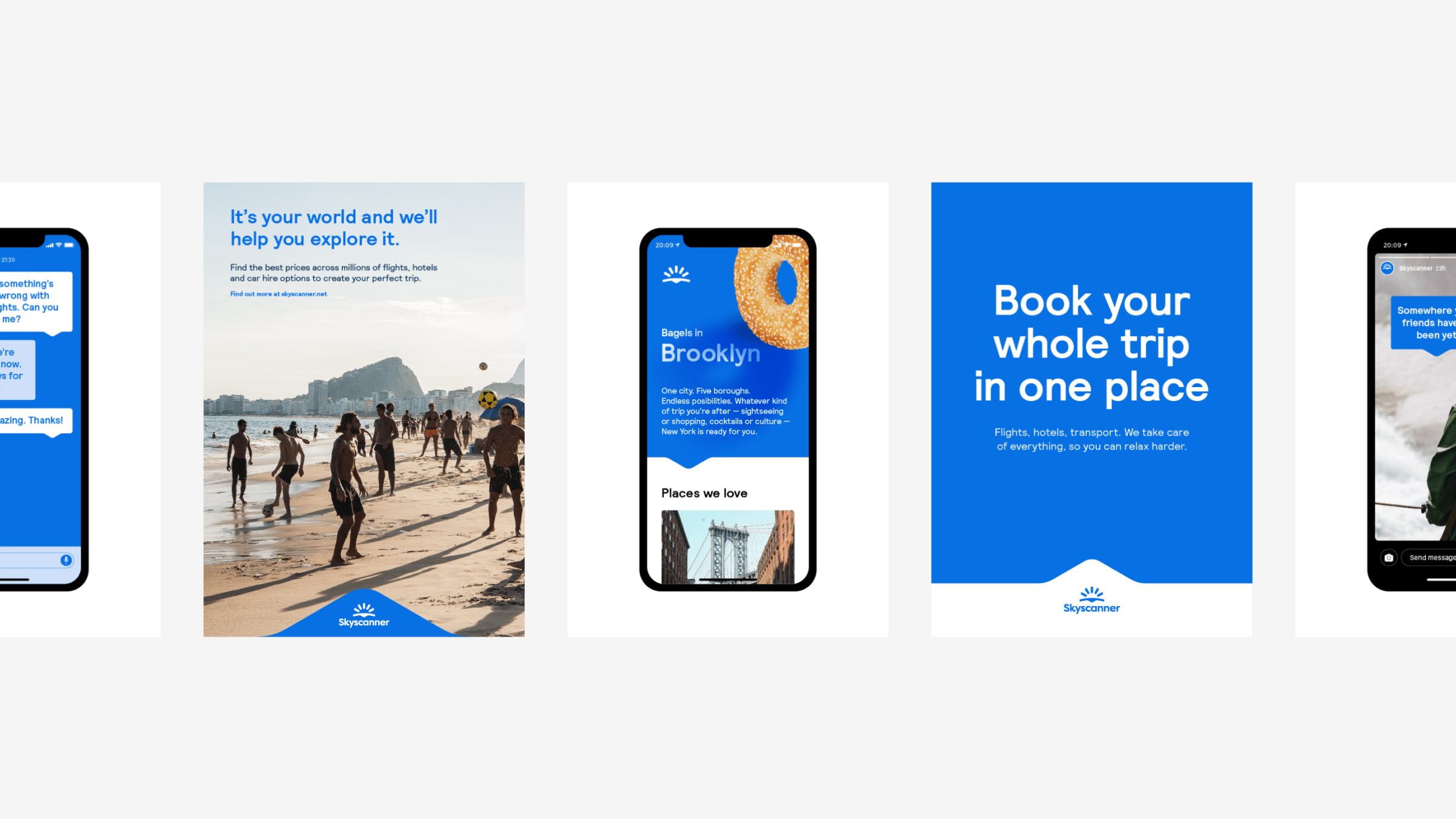
It was applied across product, campaigns, and global markets, ensuring consistency across everything from UI to large-scale marketing.






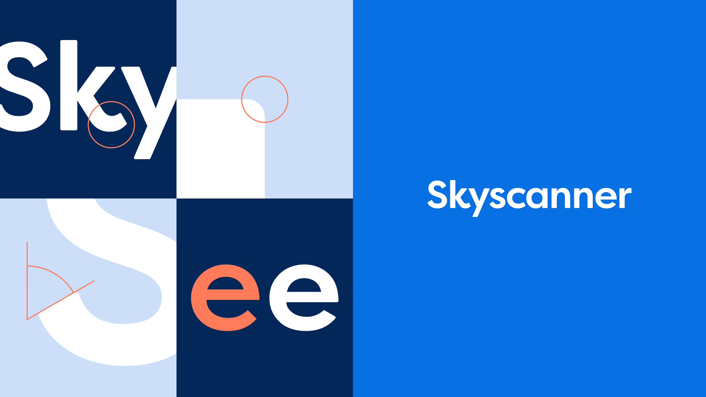
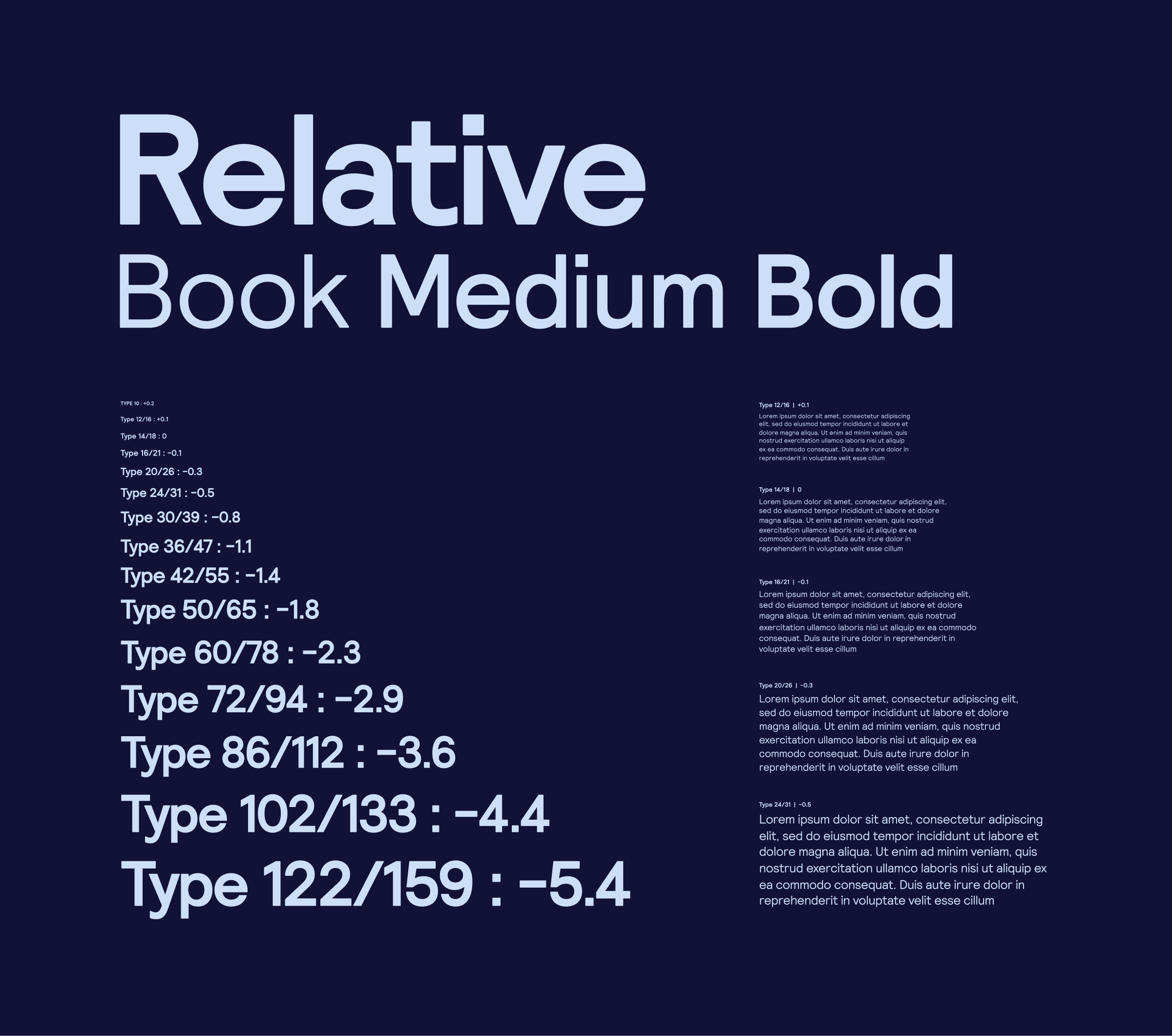
Typography is the visualisation of the brand's voice. It is not just a component of the system, but one of the main ways Skyscanner communicates tone – from functional travel details in product to expressive headlines in campaigns.
A key part of the work was the creation of Skyscanner Relative, a custom typeface developed with Colophon. Relative is a proportional graded type family whose forms reflect the geometry of the sunrise symbol. Even stroke widths and softly rounded corners create a clear relationship between type and mark, helping the identity feel unified rather than assembled from separate parts.

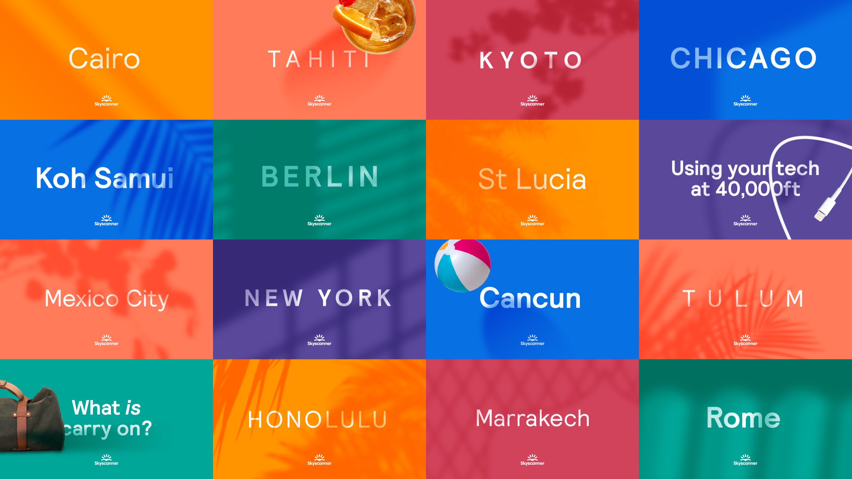



The system is intentionally controlled. Product applications use colour in a more restrained way, while campaigns and brand moments allow broader combinations and stronger contrast. Approved pairings, usage ratios, and accessibility rules ensure that the palette remains harmonious and legible, rather than decorative.
This gives the identity flexibility without losing consistency – the palette can stretch across touchpoints, but still feels unmistakably Skyscanner.









Icons play a vital role inside the product, simplifying complex actions and categories into clear, concise visual signposts.
The icon set was developed in collaboration with Iconwerk, and is built to align closely with the geometry of the wider identity. Constructed with consistent grid, stroke weight, corner radii, and controlled angles, the icons are optimised for clarity at small sizes while maintaining visual consistency across the system.


Six months after launch, the rebrand delivered measurable impact across product, marketing, and brand performance.
The rebrand expanded how Skyscanner shows up without compromising the clarity and usability that made the product successful. By introducing a more expressive and flexible identity system, the brand was able to operate more effectively across product and marketing.
Brand health improved across every measure globally, indicating stronger recognition, perception, and engagement.
✅
✅
✅
✅
Consistent user experience within and across Skyscanner's products
Faster for Product Designers to design and prototype interfaces
Faster for Engineers to develop features and applications
Faster delivery = happy users, stakeholders, and Product Managers
This increased range allowed Skyscanner to better connect with travellers emotionally, not just functionally. The brand could now reflect the anticipation, discovery, and variety that define travel, rather than being anchored purely in search.
The result was a brand that maintained trust and utility, while becoming more distinctive, more engaging, and more capable of expressing the full breadth of the travel experience.